Your building, bookable from your phone.
The first app for Weave’s co-living buildings in Hong Kong. Residents book laundry, the lounge and shared services in one place, instead of paper sign-up sheets and group chats. The hard part was the brand: the client wanted it on every screen.
§1 · Context
Weave runs co-living buildings across Hong Kong. Residents share amenities like laundry and the lounge, but booking them ran on paper sign-up sheets, queues and group chats. The brand team had a strong, detailed visual identity and wanted it used across the app.
§2 · Problem
With no shared system, amenities were hard to book. Residents over-asked, double-booked, or gave up, and the front desk rescheduled by hand every day. There was a second problem: the brand was built for print, which made the screens slow to use when someone just needed to book a washer.
§3 · Approach
Three parts.
One booking pattern for every amenity, one resident account that lasts the whole stay, and clear rules for where the brand is used.
One booking pattern, everywhere
Laundry, the lounge and the meeting rooms all work the same way: pick a slot, confirm, done. Residents learn it once, and the system tracks who holds which slot.
One account for the whole stay
A resident's account holds their bookings, their preferences and the building's notices. It lasts the whole stay instead of resetting each time they open the app.
The brand, full or minimal
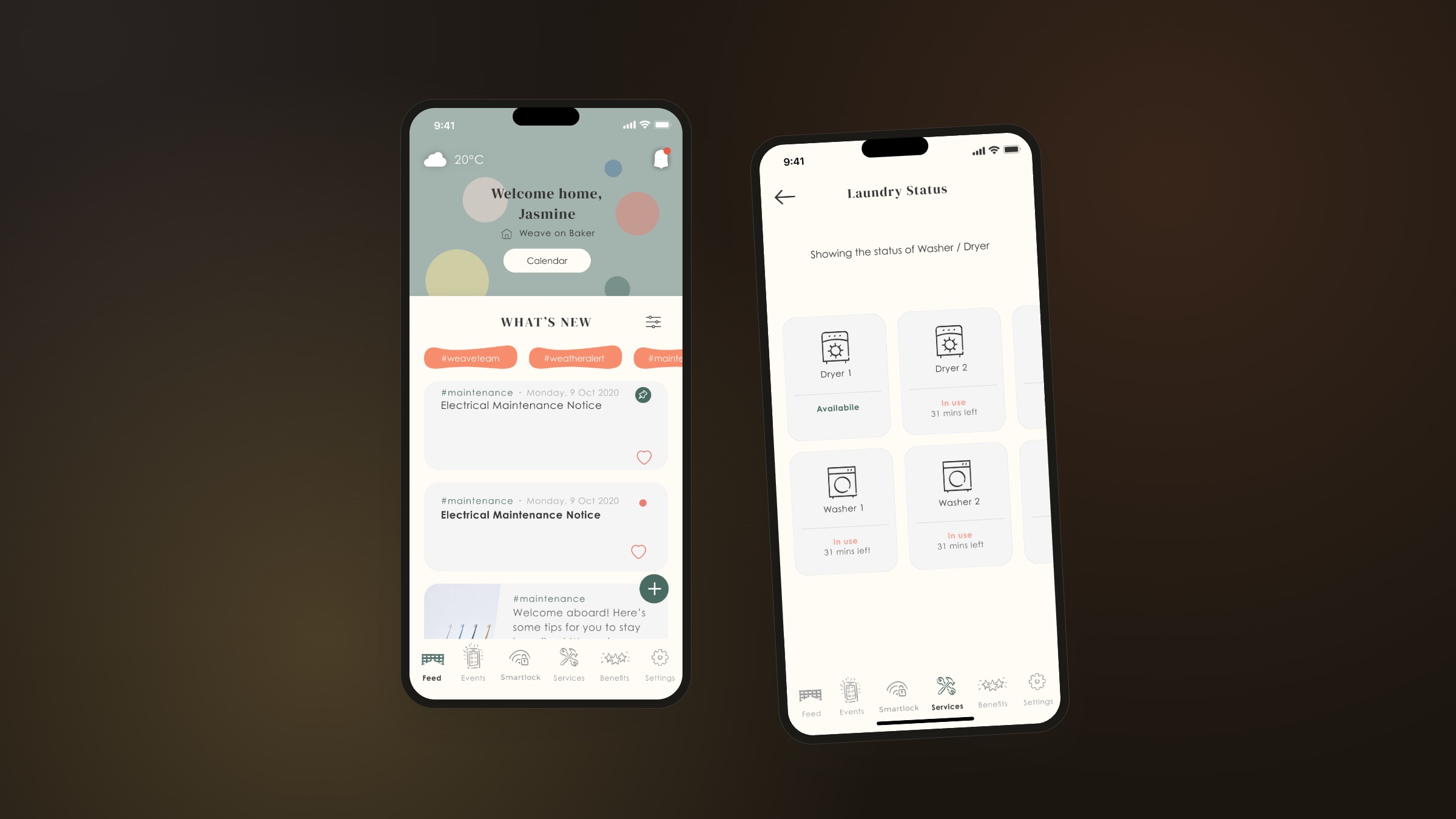
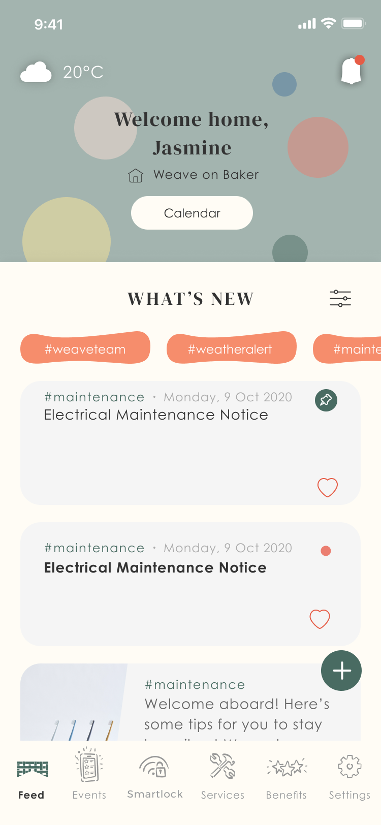
Weave's identity is detailed and polished. We used it fully on the home screen and kept it minimal on the booking screens. The colours and type are the same on both; what changes is how much of the brand each screen uses.
§4 · The brand system
The client wanted the brand on every screen. The problem was that the full brand made the screens slow to use, so instead of cutting it I set rules for where each part of the brand is used.
The mark
The logo, provided by Weave, is a building full of windows under one roof: many homes in one structure, which is what co-living is. The app’s palette, type and components follow from it.
The rule: sage and the five confetti colours are only used on the home and in building notices, never in a booking flow. Booking screens use four colours: ink for text, paper for the background, forest green for actions, and coral for live status. One fix: the original cards were a cool grey (#F5F5F5) that clashed with the warm paper, so I warmed them to a linen tone. The full kit is in the style sheet linked above.
§5 · The booking flow
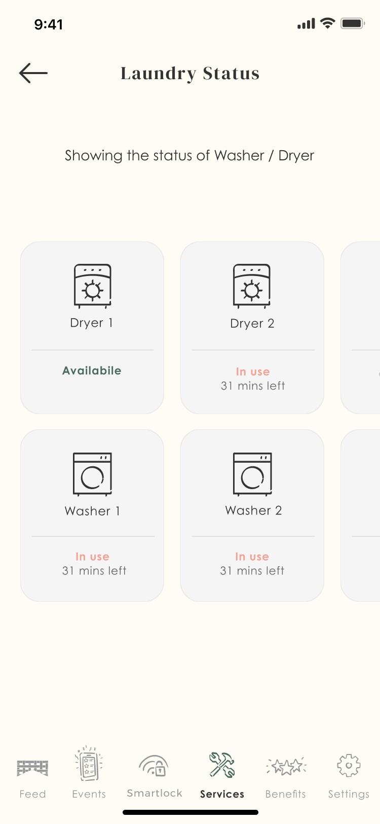
Laundry is the most-used screen, so it’s where the brand is most pared back and the task comes first. Here is the full flow, from picking a machine to a confirmed booking.
Two people, one slot
The main risk in a shared booking system is two residents picking the same slot at the same time. The flow handles it: if someone takes a slot while you’re choosing, it greys out and turns coral before you can confirm, so you just pick another. One limit: the laundry vendor only sent a 30-minute cycle signal, so “31 mins left” is an estimate, not a live reading, and the copy never promises an exact minute.
The same steps everywhere
The lounge and meeting rooms use the same two steps: pick a slot and confirm. Residents learn it once and it works the same everywhere.
§6 · Member identity — the stay
A booking lasts a few hours; a stay lasts months. The account is built around the whole stay, not one booking at a time. It keeps your bookings and the building’s notices in one place, instead of resetting each time you open the app.
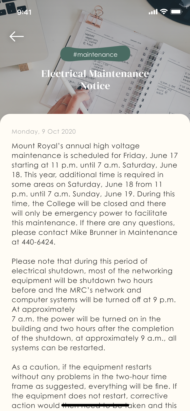
Here both come together: a building notice in the full brand style sits in the same list as a booking you made. Together they become a record of the whole stay, not a set of one-off actions.
“I used to text the front desk every Sunday to ask if a washer was free. Now I just book it on the train home. It feels like part of the building, not another app.”
§7 · What shipped
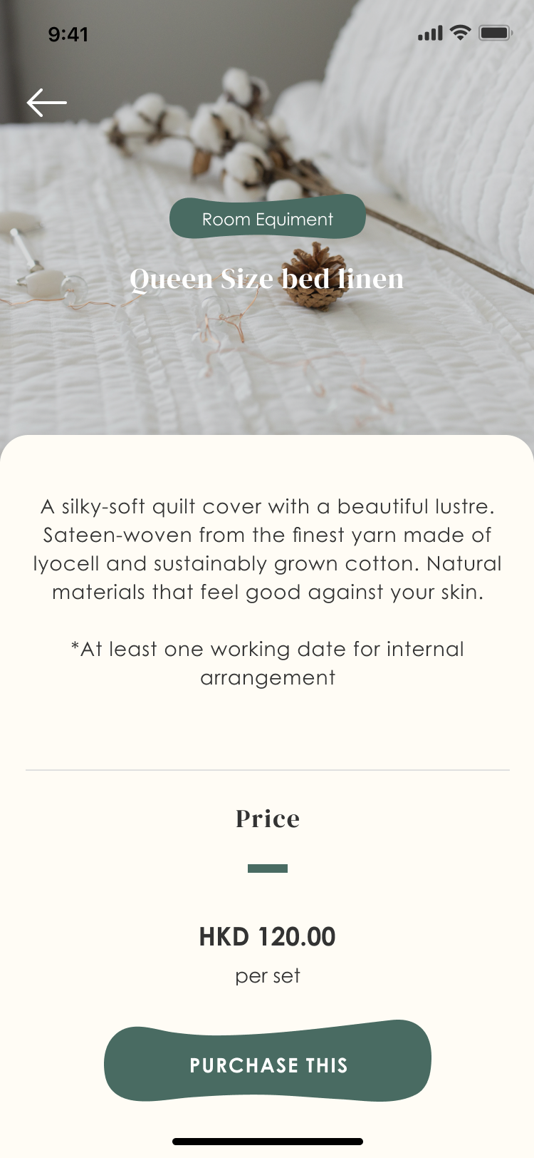
Four screens that shipped: the home in full brand, the laundry status pared back, a service detail, and the building announcements.
§8 · Reflection
The first version I shipped was too quiet. I’d been too careful with the brand and made every screen, booking included, look like the building’s print brochure. The brand lead pushed back, and she was right: people use the app to get things done, and that matters as much as the brand. The fix wasn’t less brand. It was deciding which screens use it fully and which keep it minimal.