A carbon tracker, read like a weather app.
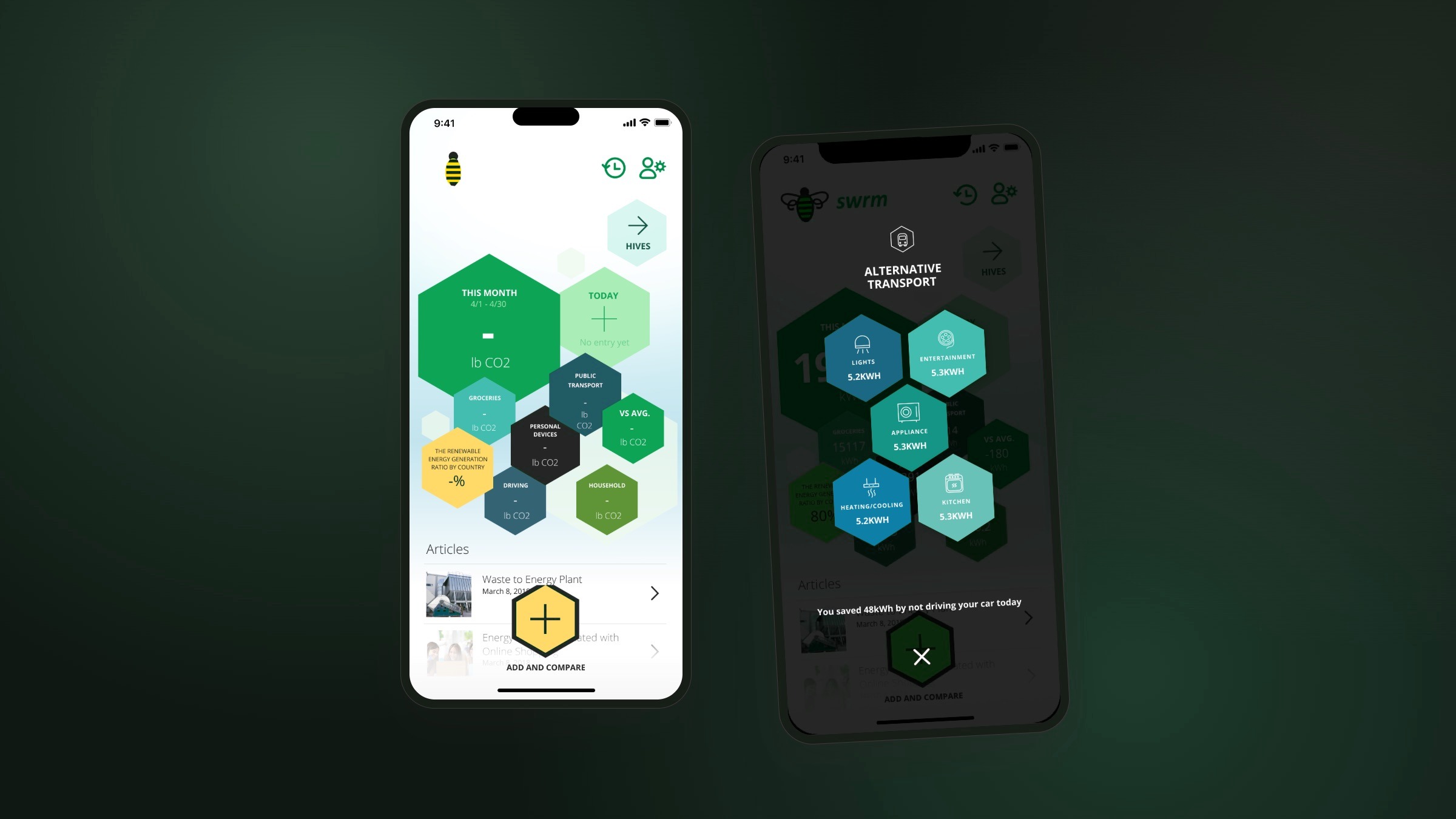
A personal footprint tracker that turns everyday spending and travel into a honeycomb that shifts as you live. Early work, and where my eye for motion and data visualisation started.
§1 · Context
2017–2018. People cared about their carbon impact but would never open a spreadsheet for it. The idea: if your footprint were as easy to read as a weather app, you’d actually look.
§2 · Problem
Carbon impact is invisible at the moment of decision. The data exists — your transactions, your travel — but it sits where no one thinks to look. SWRM’s job was to fetch it for you and hand back something you could read in a second.
§3 · Approach
Three moves carried it.
Match the inputs to a routine people already had, give the numbers a shape that moves so the comparison is obvious, and give people a reason to open the app again tomorrow.
Inputs that matched routine
Spending and transport were the only two inputs, and both were things people already did every day. Logging took seconds, and the form never asked anyone to learn anything new.
A footprint shaped like a hive
Instead of a static chart, the breakdown was a honeycomb that resized with every entry. Log a long-haul flight and you watch one cell swell past the others — the difference lands before you've read a single number.
A reason to come back
The feed was built to be glanced at, not studied — logging a transaction took three taps start to finish. The daily check-in had to feel like less effort than it really was.
§4 · Design concept — the hive
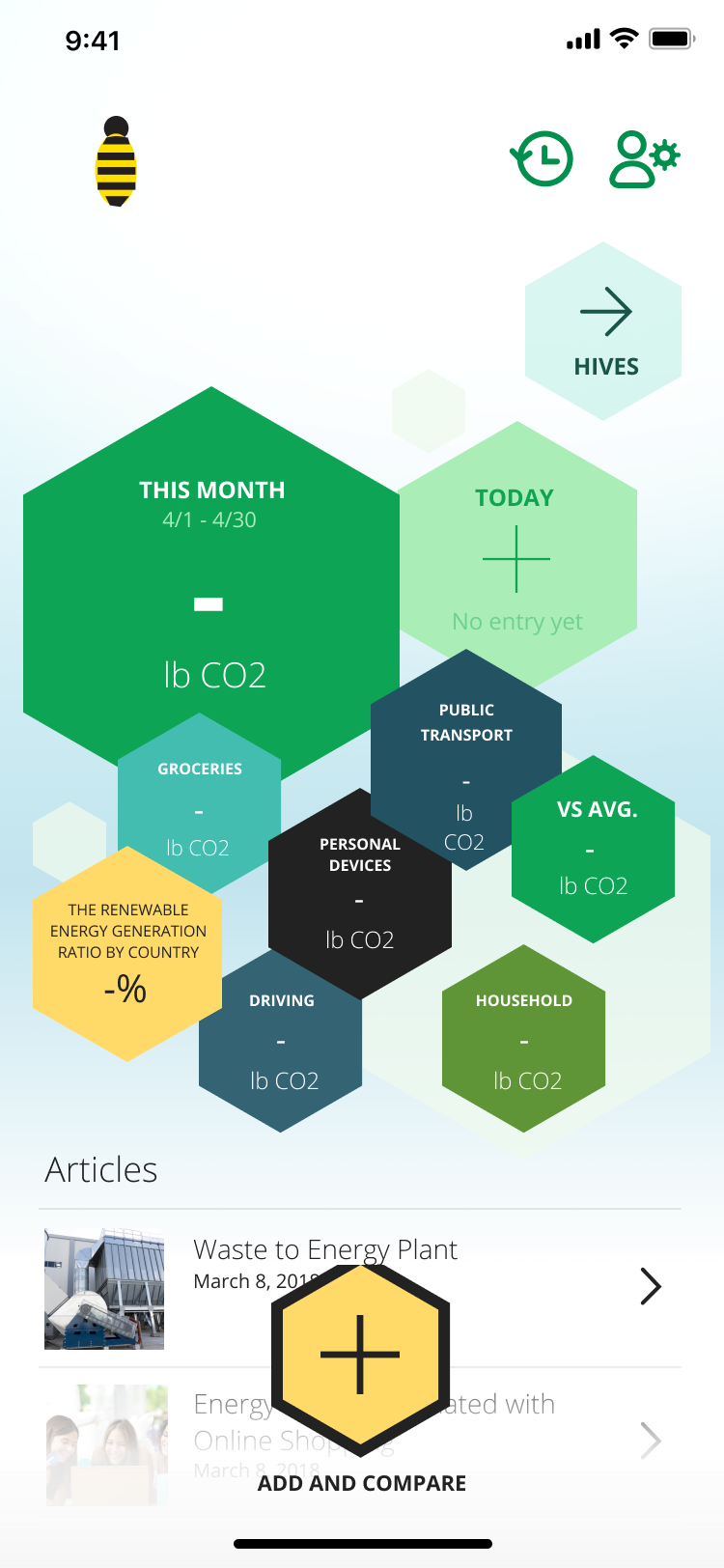
Most carbon trackers are a chart. SWRM is a hive. The name is a swarm, the mark is a bee, and every entry you log is one cell in a honeycomb.
How the idea developed
The hive wasn’t the starting point. It came together one decision at a time.
The bee fits for two reasons. A hive runs on thousands of small actions that only count once you add them up — exactly how a footprint works. No single coffee or commute matters; the swarm of them does. And the hexagon is nature’s most efficient shape: the most space for the least material. So it became the unit for the whole app.
One rule makes it work: each cell’s size is its carbon. A low-impact month builds a calm, even comb. One long-haul flight swells a single cell until the others shrink around it — the imbalance is the first thing you see.
The brief assumed a breakdown chart. The hive was the harder call — and it became the visual language the rest of the app is built on (§6).
§5 · How it was built
Two things made it work: an input that cost nothing to use, and a visual that made the numbers obvious. Here’s how each one was built.
The input, made invisible
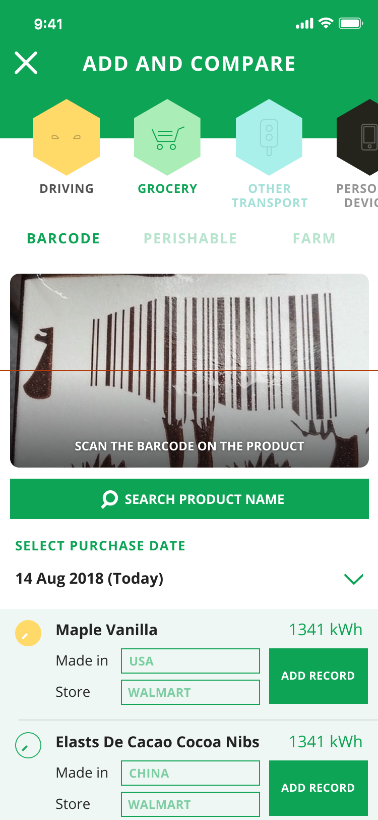
Both inputs were pre-filled from data people already generated. Logging ran three taps start to finish — pick the cell, confirm the amount, done — so the daily check-in felt lighter than it really was.
Why it moves
Motion wasn’t decoration. Every entry runs the same short loop — re-weigh the totals, resize each cell, let the comb settle — so you can see what changed at a glance. The hive in §4 is that loop, running live.
§6 · What shipped
Three screens carry the loop: the hive you glance at, the few-second log, and the monthly review that makes the daily habit worth keeping.

§7 · Reflection
SWRM is the project I come back to when I need reminding that data products don’t have to feel like data products. The move was simple: make the footprint a hive, and let the shape carry the meaning. One swollen cell says more than any number. It was never in the brief, but it carried the launch — and it’s still the screen I measure new data work against.