DSE prep, rebuilt around practice that adapts.
An e‑learning platform for Hong Kong's university-entrance exam: mock papers, study materials, and the studio's first deep integration of Gen‑AI into the design loop. Teachers used to rebuild the same papers over several days in PDF and Word; now they do it the same day, in the platform.
§1 · Context
HK DSE is the public examination that decides where Hong Kong students go to university. High‑stakes, repetitive, and historically badly served by static PDFs. The brief: one platform serving three audiences — students practising, teachers authoring, admins overseeing.
§2 · Problem
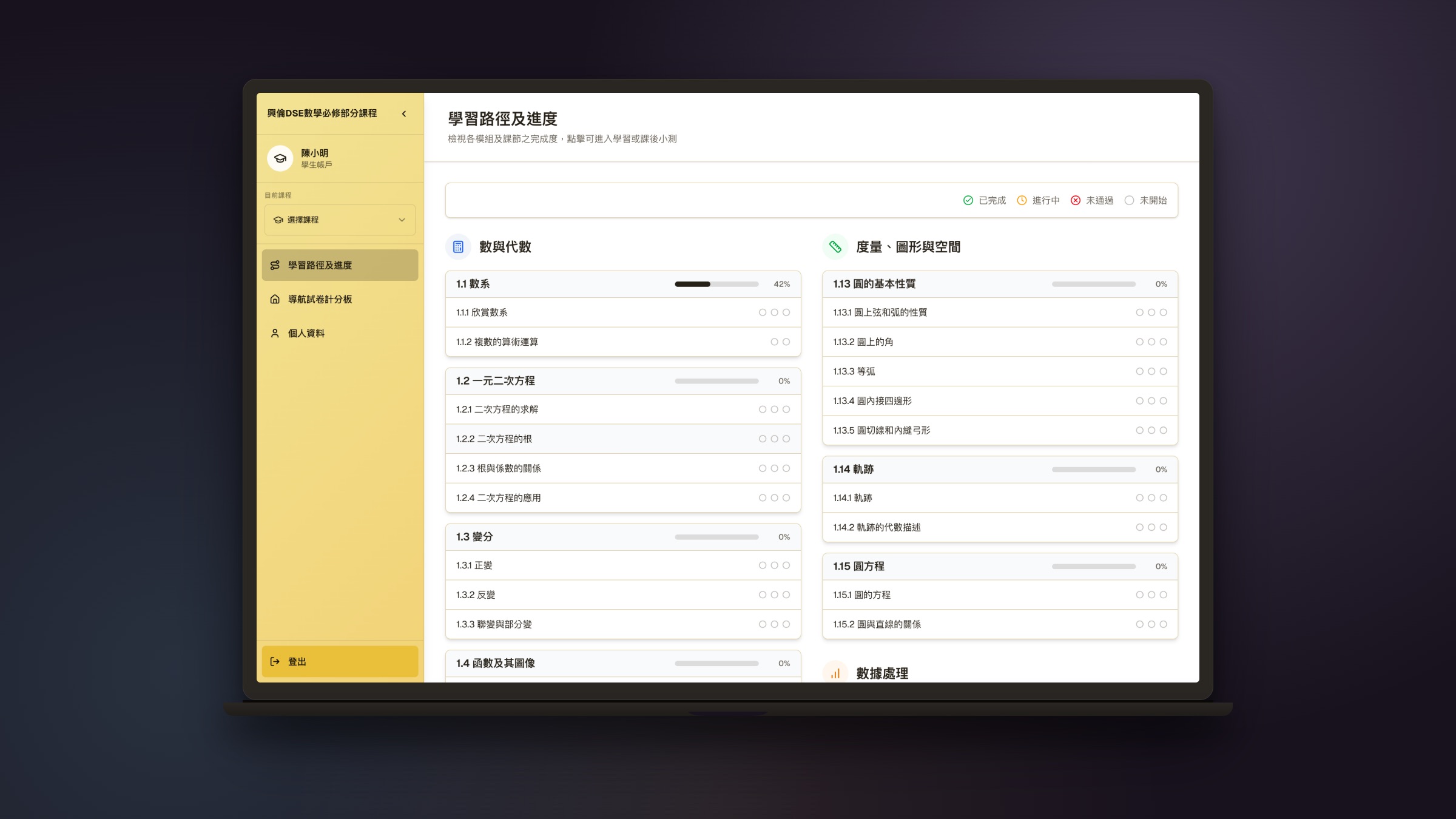
Three audiences, three different definitions of “done.”Students need practice that adapts and clear feedback. Teachers need to build materials once and reuse them across a class. Admins need to see how classes are doing without micro‑managing. The hard part was one shared platform that served all three without watering any of them down.
§3 · Approach
Two parallel tracks: the product, and the way we built the product.
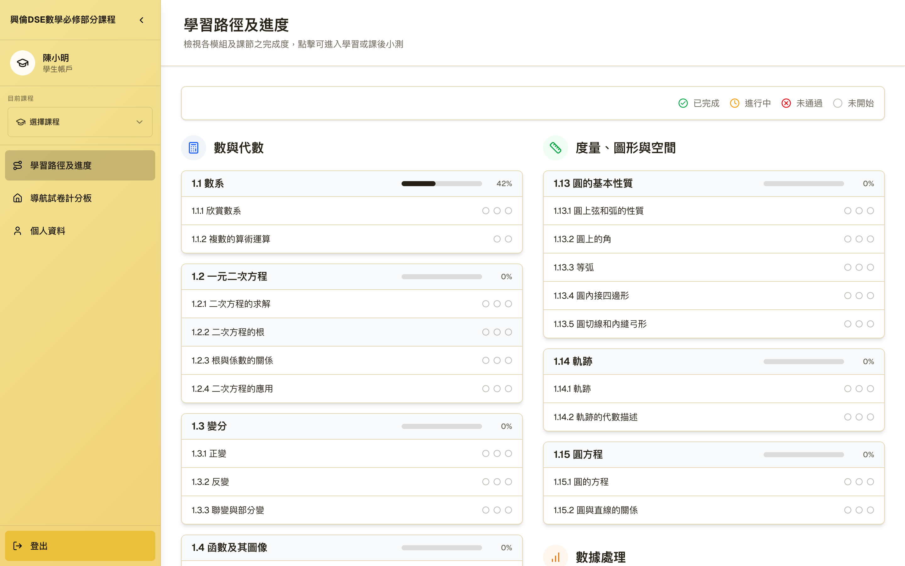
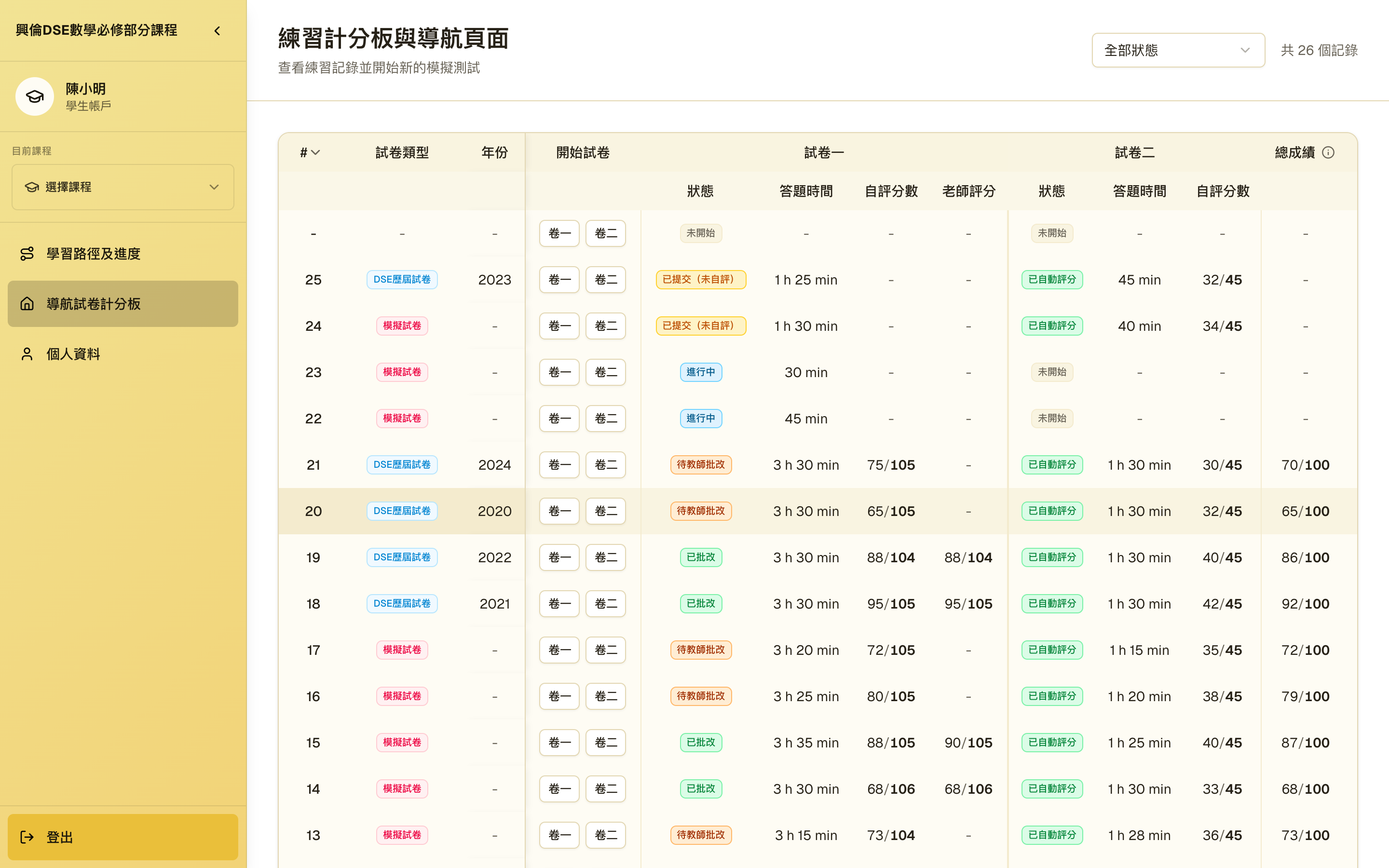
Mock papers and platform materials, sequenced by performance rather than by file order. The student screens hide all of that and just show the next thing worth trying.
Teachers can build, edit, and re-issue mock papers without an engineer in the loop. The authoring tools are where most of the AI help sits: starter drafts, suggestions, and review steps that let one teacher reach a whole class.
Admins see the school, not the individual screens — class progress, prompts to step in, and clear reporting so leadership can act on what is actually happening.
The studio's first project to build Gen AI deep into how we design. We went from spec to working screens in days instead of weeks, and I still made the final call on every direction.
DSE is sat in both Chinese and English, sometimes paper-by-paper. Student and teacher screens lead in Cantonese, with bilingual marking-scheme wording, tested with teachers across HK secondary schools.
“Before this I was rebuilding the same mock paper in Word every term. Now I author it once, the students sit it, and I can see straight away which students need help. I stopped working on weekends.”
§4 · Process
The working file, not the gallery. The first pass was student‑first and we abandoned it. Most of the process went into the flows that run the product: how a student sits a mock paper, how a teacher grades it and checks class progress, and how real paper sets, schools, teachers and students are managed behind it all.
↑ Teacher tools were hidden inside a settings tab.
We dropped this version in week 6.
Step 04 took the most rounds to get right.
One admin portal manages both chains.
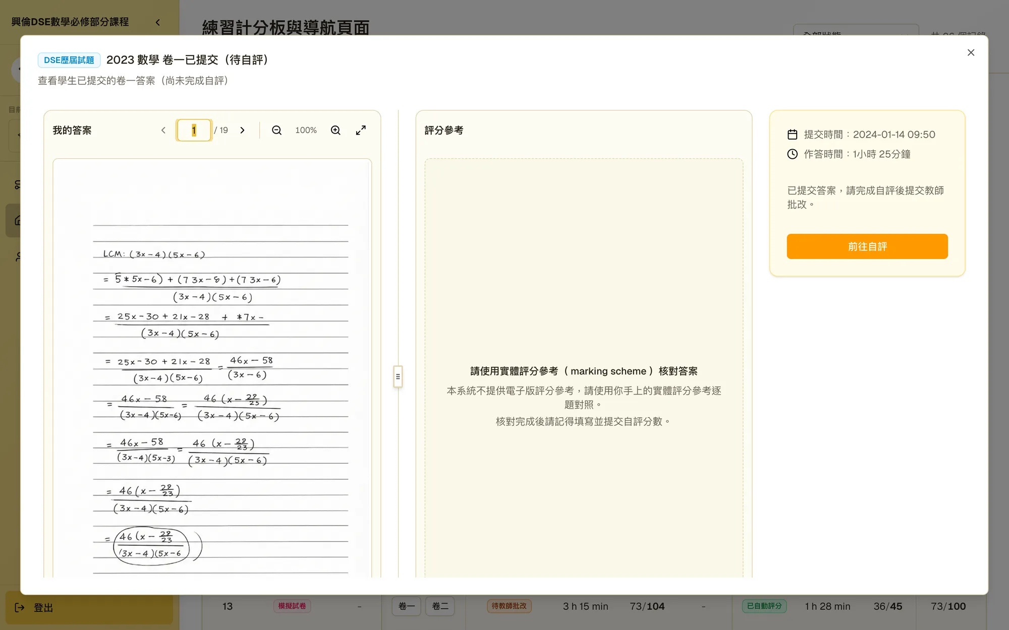
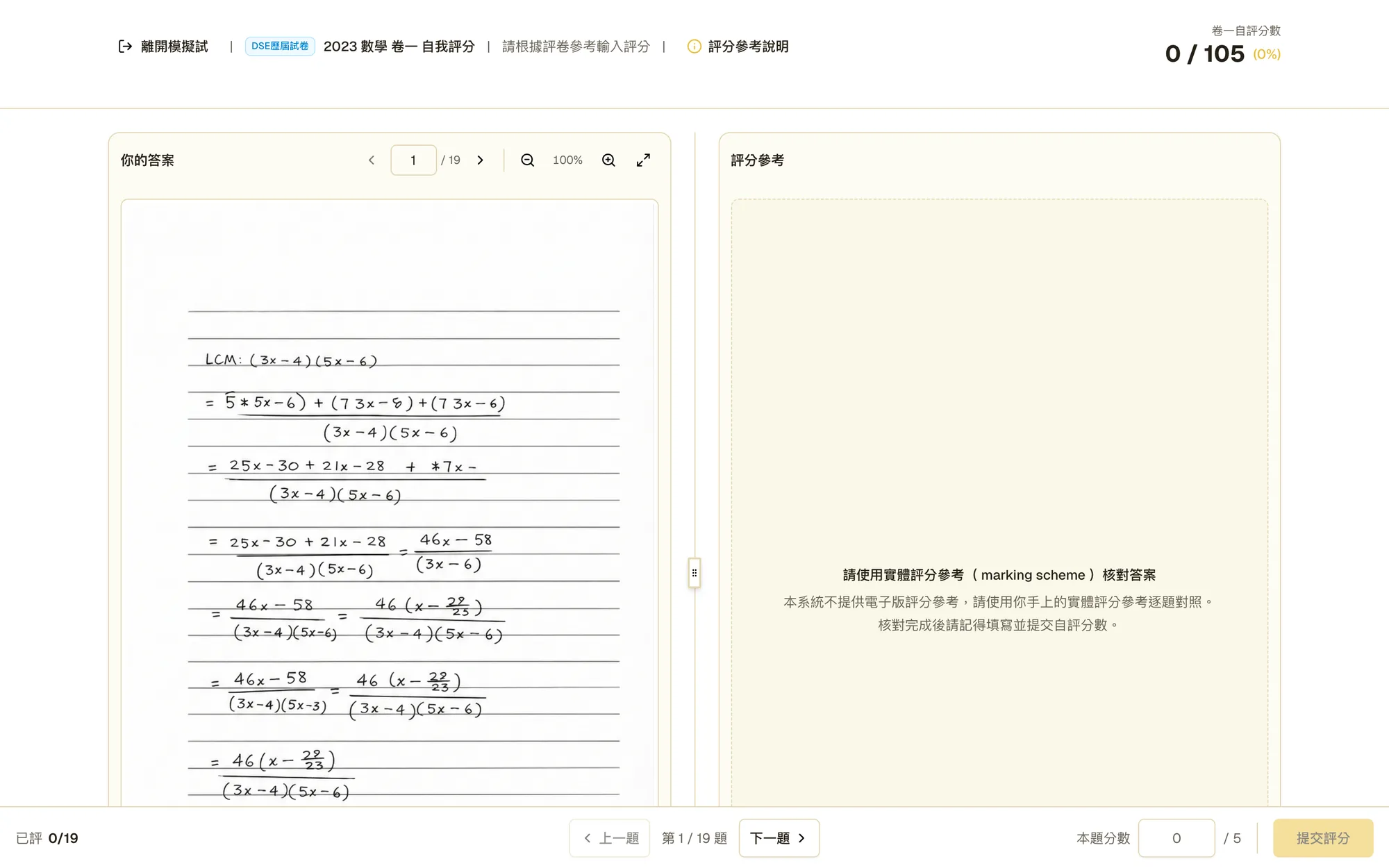
Self-grade runs first, so the teacher confirms instead of starting from zero.
Answers one question: which students need help, and on what.
§5 · Ways of working
The other half of the process is how the team worked: AI multiplied the drafts, Storybook carried the handoff, and the repo carried the review.
↺ 02 and 03 run several times a day. The AI multiplies drafts; it never picks the winner.
Every state is a named story. Dev builds from stories, not screenshots.
UI changes don't merge without design review.
§6 · Hard problems
Three problems shaped the student surface more than any layout decision. The third was the hardest.
DSE maths is full of fractions, roots and vectors. Flatten them to plain text and the on‑screen paper stops looking like the one the student will sit.
What we did · Questions and marking schemes render true notation, so the screen matches the printed paper exactly.
The bus comes, the tab closes, dinner is ready. A timed mock that loses progress punishes practice, and practice is the whole product.
What we did · Answers and the clock autosave. Coming back offers one clear choice: continue with the time left, or start clean. The attempt record shows which one happened.
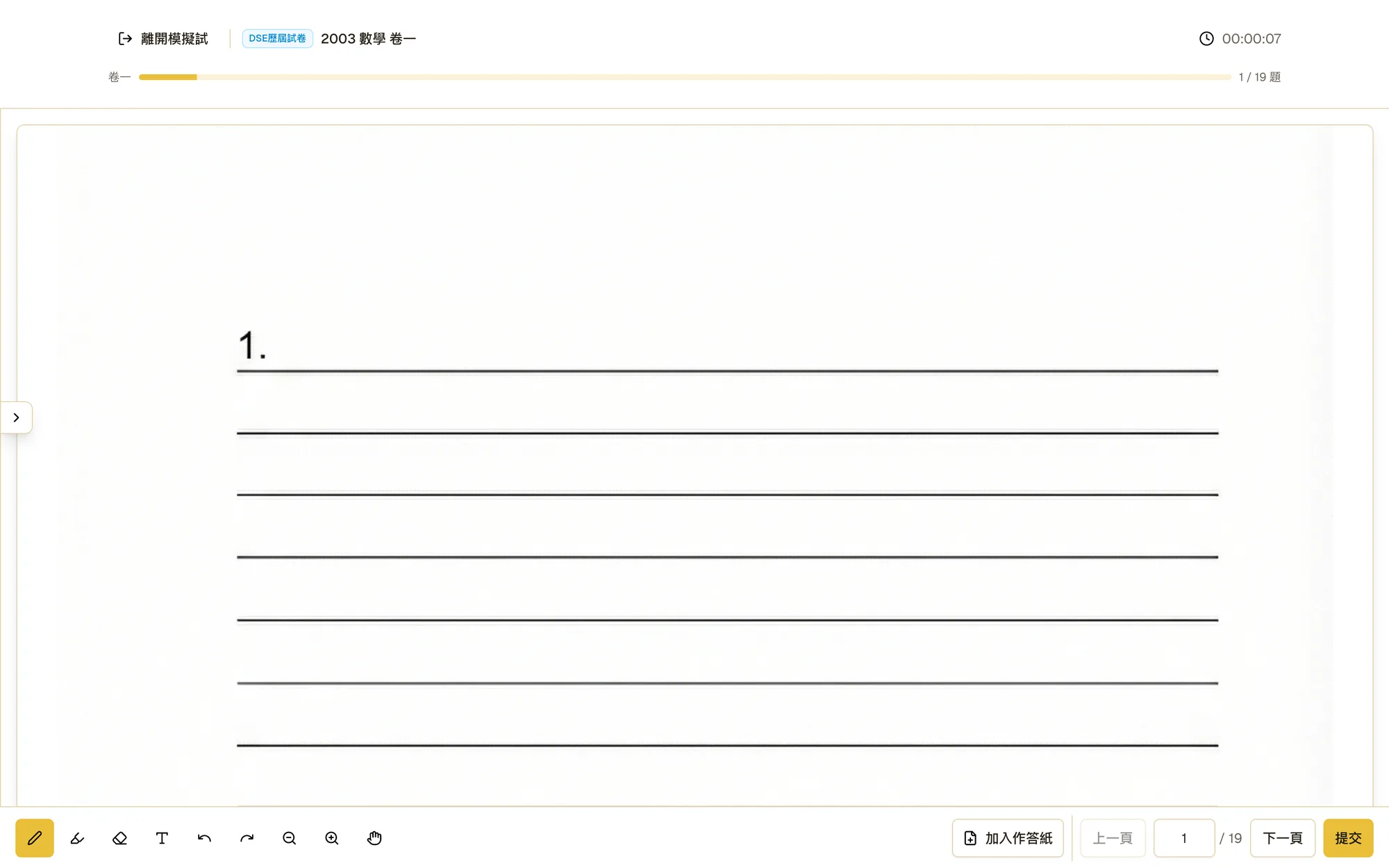
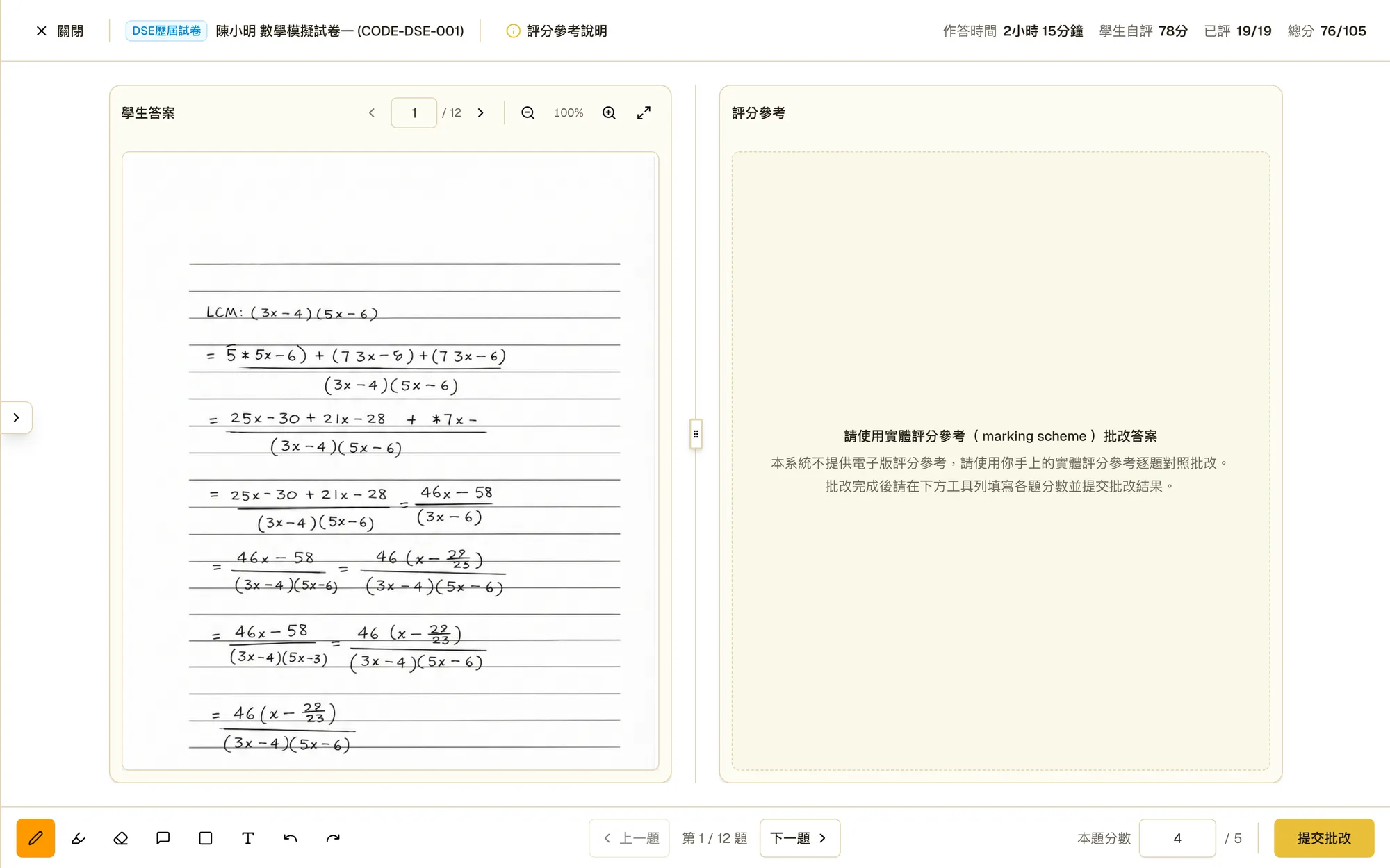
In the real exam, students write long answers by hand, so the canvas had to take handwriting. But handwriting on screens is messy: every device draws differently, and a resting palm draws too.
What we did · Tuned the canvas per device. On iPad, a pencil‑only setting means Apple Pencil draws and a resting palm never does. Other tablets get palm rejection on the canvas itself, and phones fall back to finger input. The goal: the same paper feel on every device a student actually owns.
§7 · Three audiences, one platform
Practice that adapts · ruled answer canvas · self-grade against the marking scheme
§8 · Reflection
I started Hanlun believing the student was the hardest audience to design for. I was wrong: we killed the student-first version in week six, because the platform lives or dies on the teacher's experience. The hardest work wasn't layout. It was maths that looks like maths, a paper you can quit and resume, and handwriting that behaves on every device. On AI, my take is simple: it made drafts faster, not decisions. My judgement calls got bigger, not fewer.